Creative Director: Andrea Lomelí
Art Direction: Julio Anaya
Copywriting: Diana Soberanis
Graphic Designer: Rose Salzmann
Milvidas is a small independent bookstore located on Paseo de Montejo, in the heart of Mérida, a meeting point for local, national, and international visitors. Its carefully curated selection brings together fiction and nonfiction, with a focus on Latin American authors, objects created by local designers and artisans, and conversations that show how learning can happen in many different ways. More than selling books, Milvidas creates meaningful encounters between people and stories.
To build the brand of a new bookstore from the ground up—including naming, verbal identity, and visual identity—positioning it as a vibrant cultural space rather than simply a place to buy books.
To challenge the perception that reading is boring and stand out in a city with a thriving cultural scene, where bookstores often communicate in an informative way without a distinctive voice. The brand needed to connect with curious readers aged 25 to 35, both locals and tourists, who seek something deeper in a bookstore: emotion, knowledge, and connection.
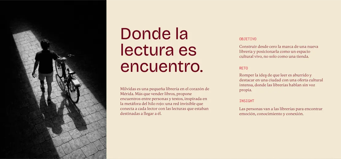
We started with a key insight: people don't visit bookstores just to buy books; they go hoping to discover something. From this idea emerged the concept “Where Reading Becomes Connection,” inspired by the metaphor of the red thread: an invisible network connecting every reader to the stories they are destined to discover.
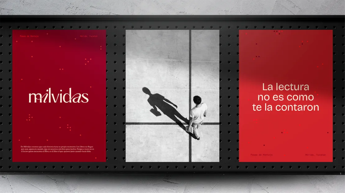
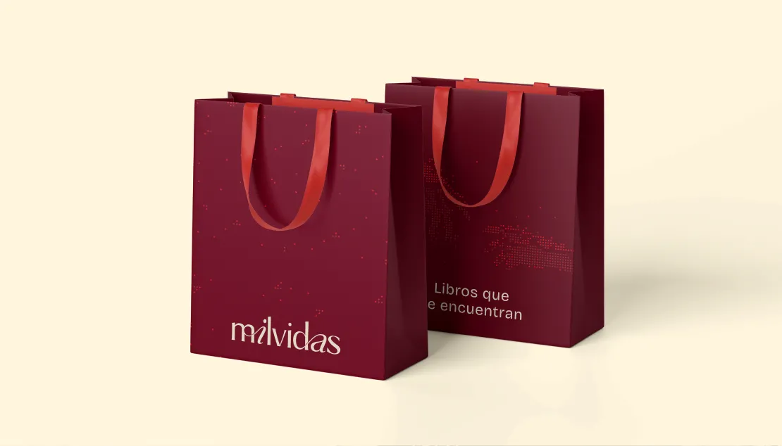
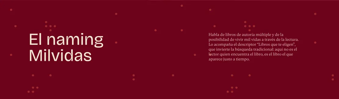
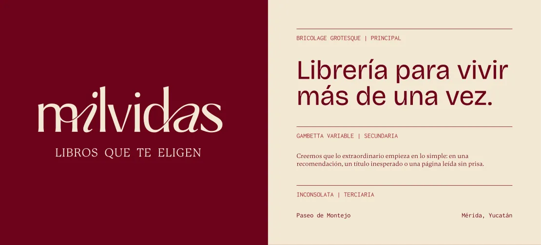
The name Milvidas—meaning A Thousand Lives—reflects the many voices behind books and the possibility of living a thousand lives through reading. It is accompanied by the tagline “Books That Choose You,” which reverses the traditional search: here, readers don't find books; books find them at just the right moment.
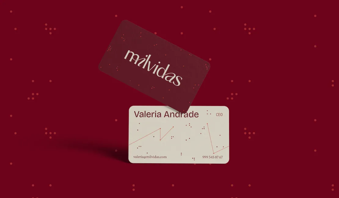
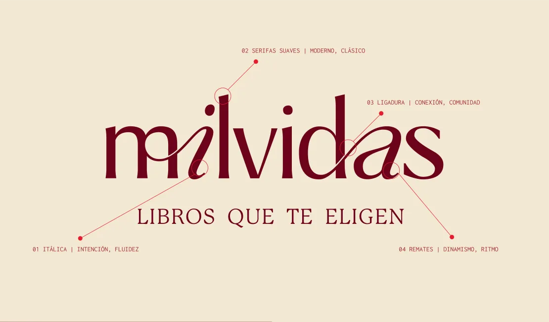
For the logo, we designed a custom typeface that combines classical features with dynamic, contemporary letterforms. Its ligatures connect the letters, symbolizing human encounters, while its terminals, italic forms, and soft serifs create rhythm, fluidity, and an elegant, approachable, and timeless character.
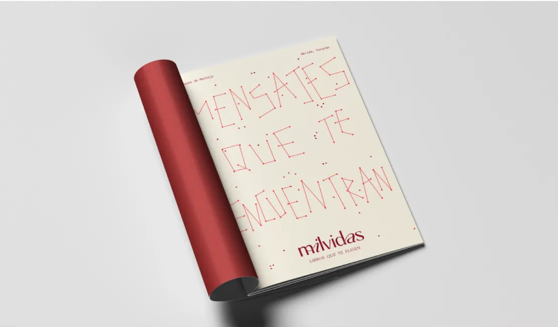
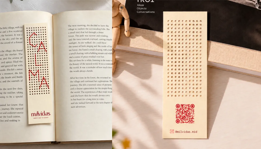
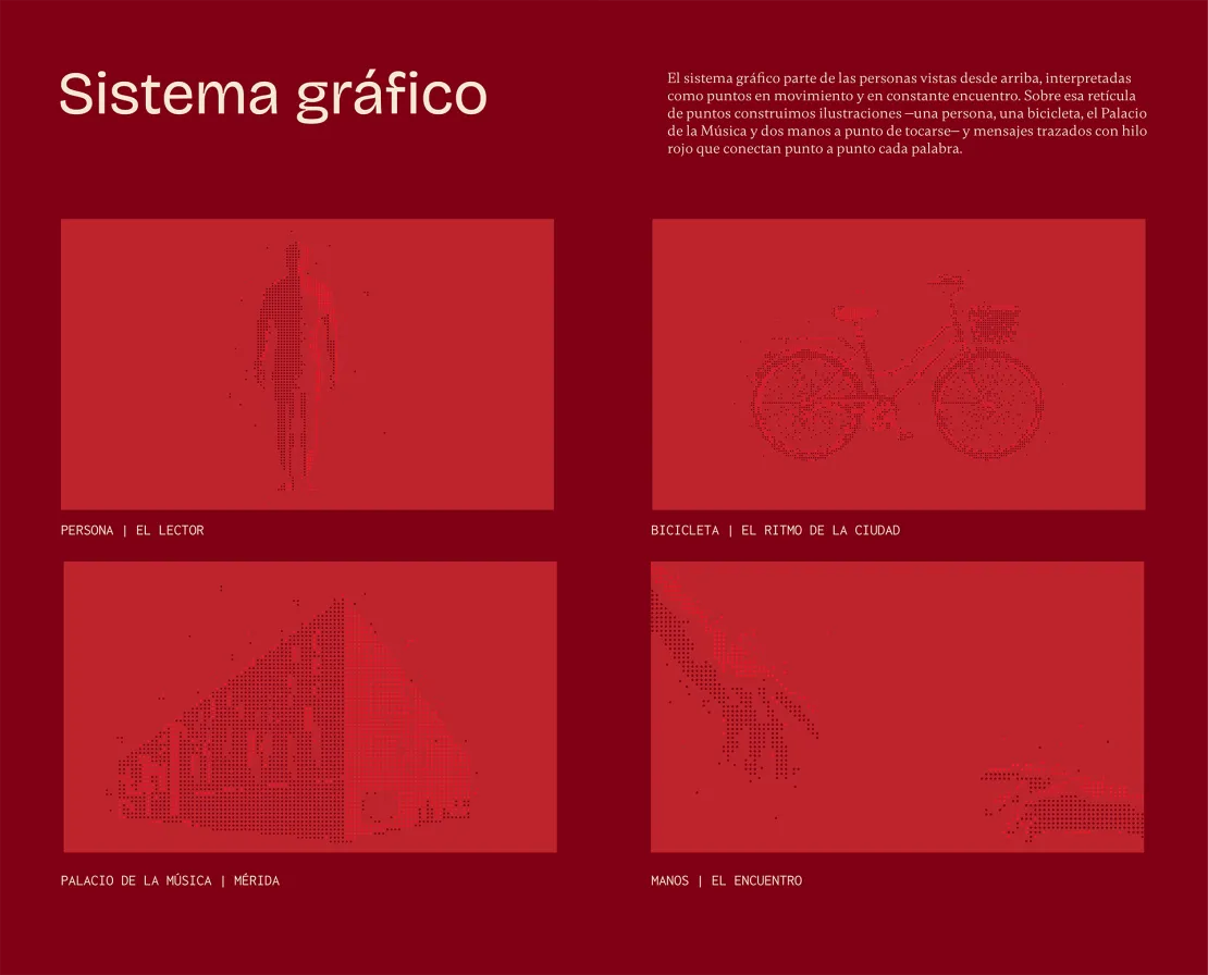
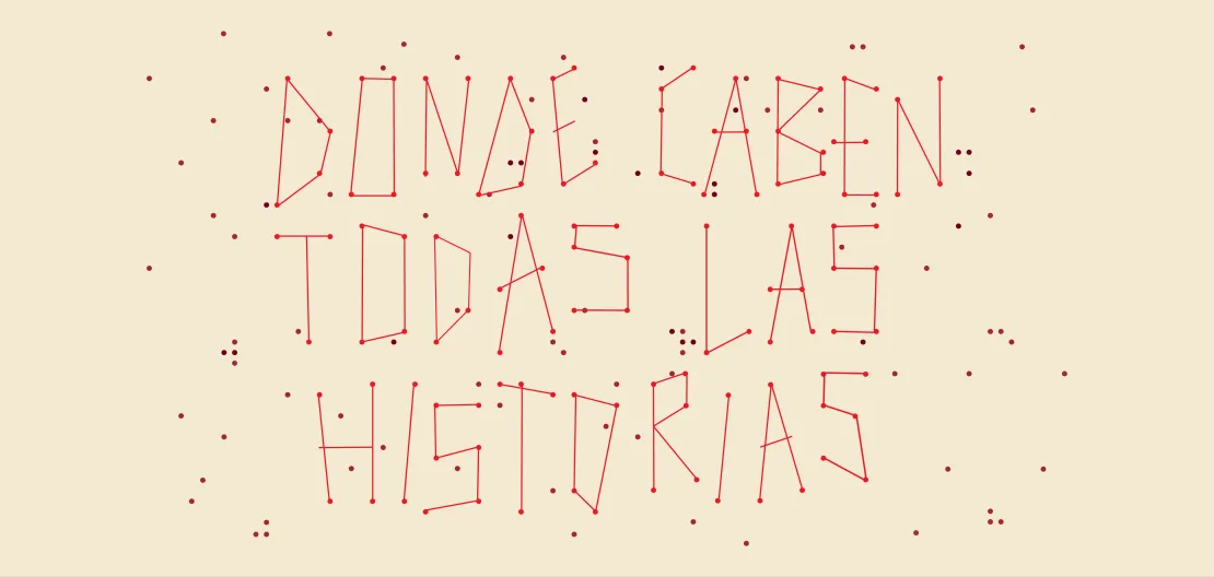
The visual system draws inspiration from people seen from above, represented as dots in constant motion and connection. Using this dot grid, we created illustrations—including a person, a bicycle, the Palacio de la Música, and two hands about to touch—along with messages formed by a red thread connecting each word, point by point.
The color palette revolves around shades of red: Terracotta Encounter (warm, human), Burgundy Connection (deep, reflective), Between Pages (bright, timeless), and Red Thread (energetic, vibrant). Bricolage Grotesque brings a modern voice, Gambetta adds a classical literary feel, and Inconsolata evokes the quiet intimacy of notes written in the margins.
Milvidas speaks with a voice that is wise, creative, magnetic, and warm, talking about books the way someone recommends something they genuinely care about. Its central message, “Messages That Find You,” comes to life through phrases such as “A Bookstore to Live More Than Once” and “Where Every Story Belongs.”