Creative Director: Andrea Lomelí
Art Direction: Julio Anaya
Copywriting: Diana Soberanis
Graphic Designer: Susana Vivas
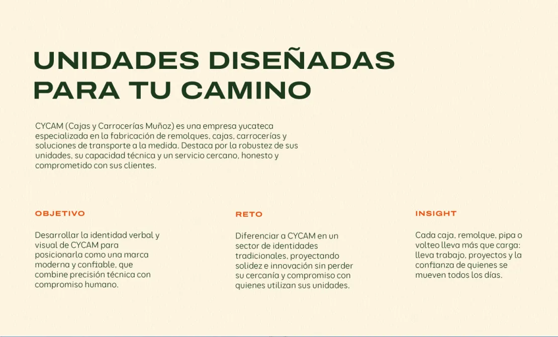
CYCAM is a Puebla-based company specializing in the manufacturing and customization of cargo boxes, truck bodies, trailers, and transportation equipment.
Its story began in 1999, when Pascual Muñoz Sosa decided to start a business with a clear vision: to offer high-quality products, create job opportunities, and build a company people could trust.
What started as a small workshop gradually grew into a company with greater production capabilities, new projects, and a reputation built on the trust of its customers.
After more than two decades, CYCAM needed an identity that reflected everything it had achieved and where it wanted to go. We wanted to portray a strong, modern company ready to continue growing, without losing the human side that has always been part of its story.
This led us to the project's mantra: behind every load, there is a story that needs to move forward.
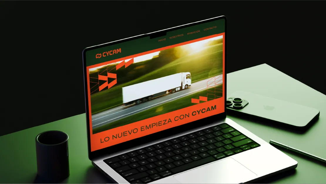
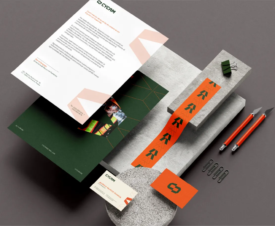
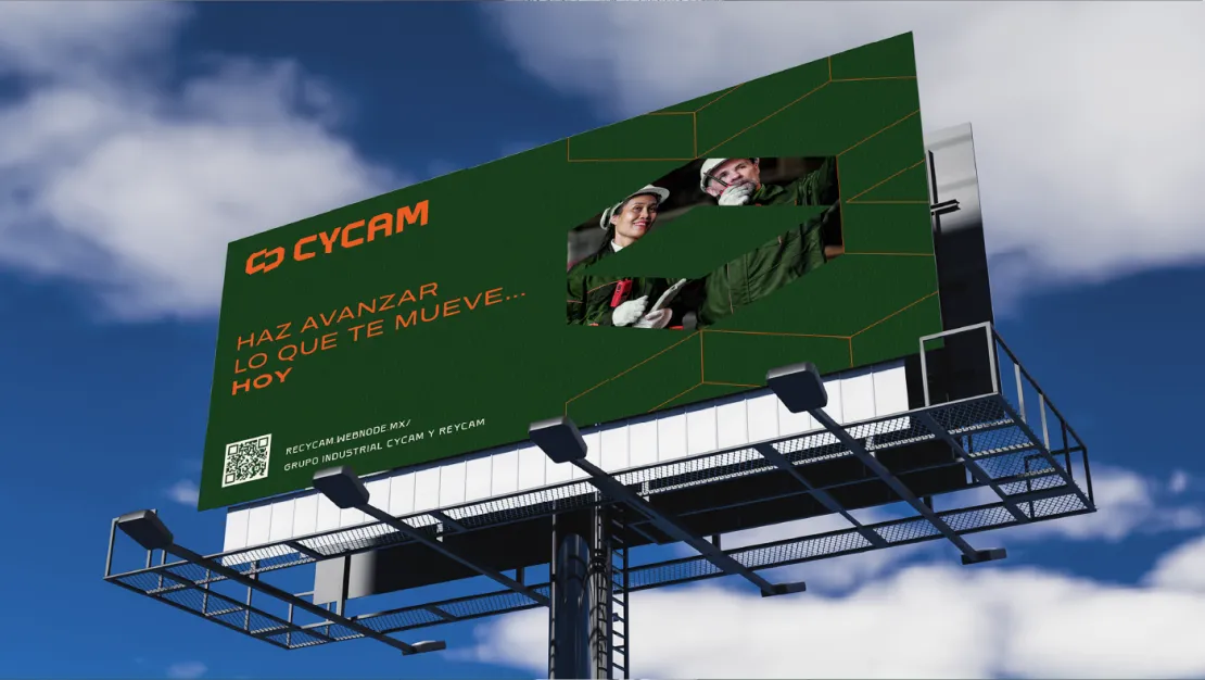
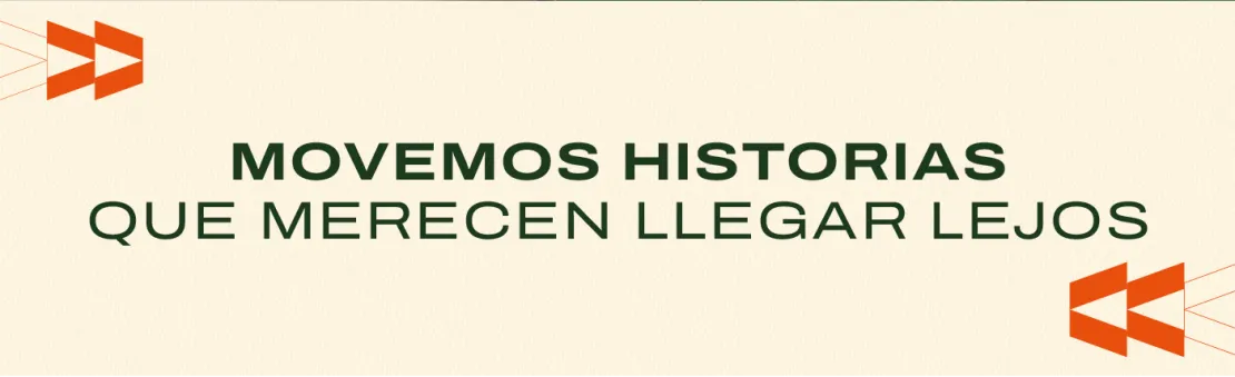
Under the concept “We move stories that deserve to go further,” we created a visual identity that reflects both CYCAM's strength and its commitment to the people who trust its work.
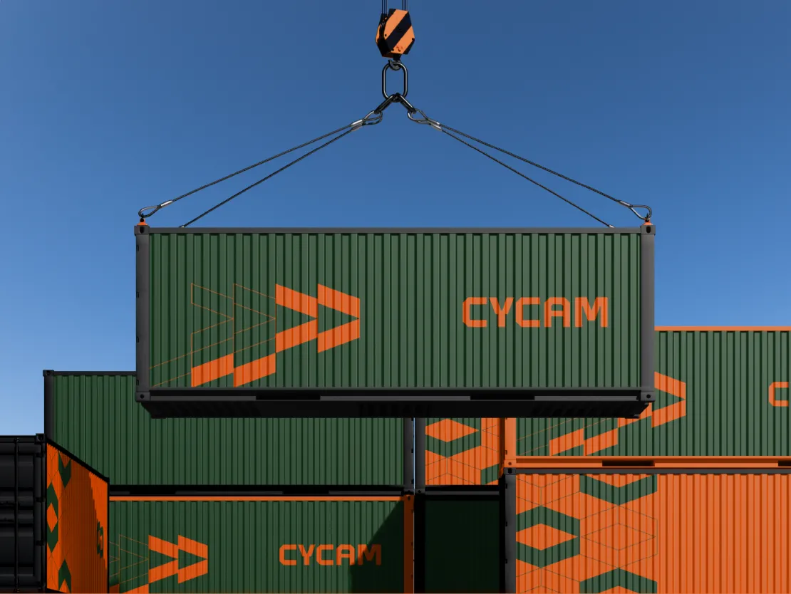
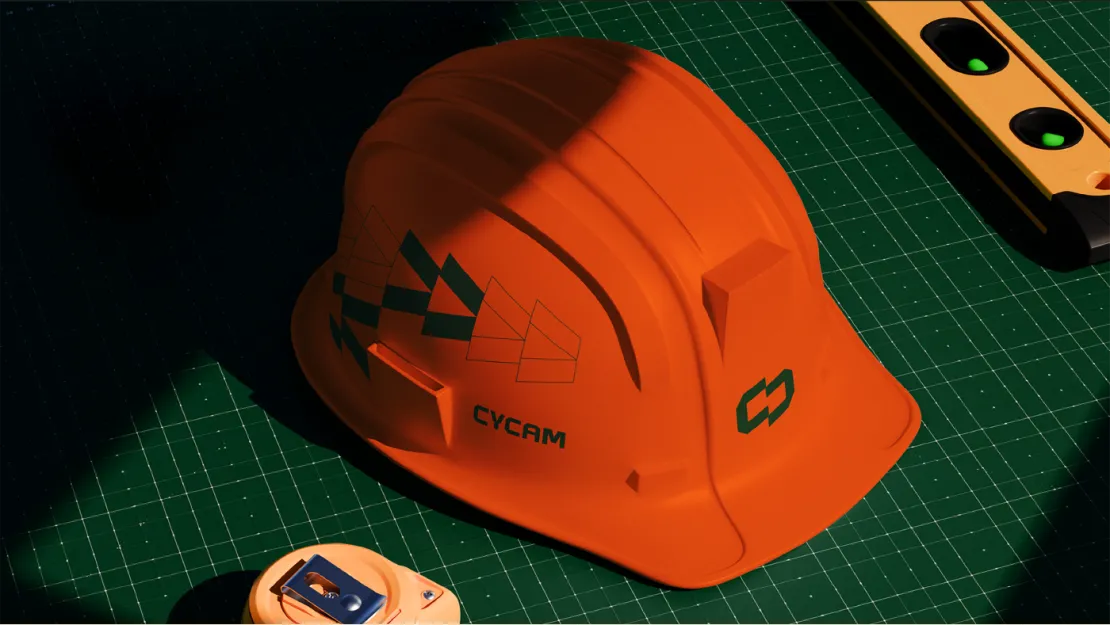
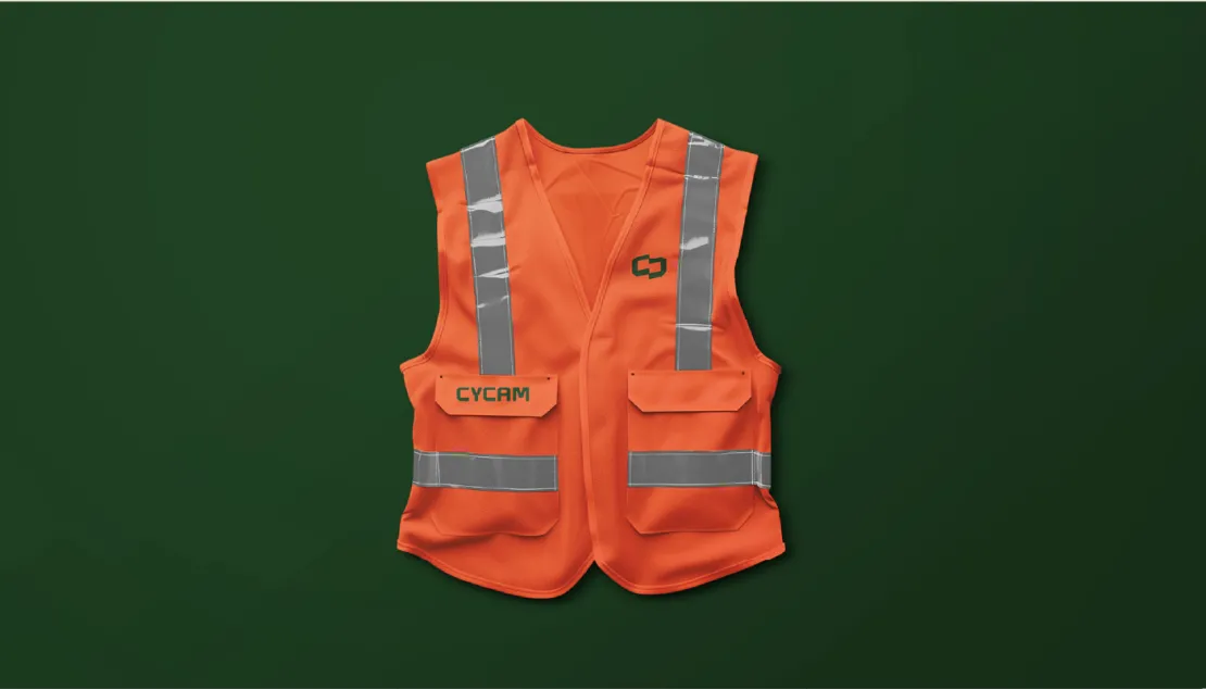
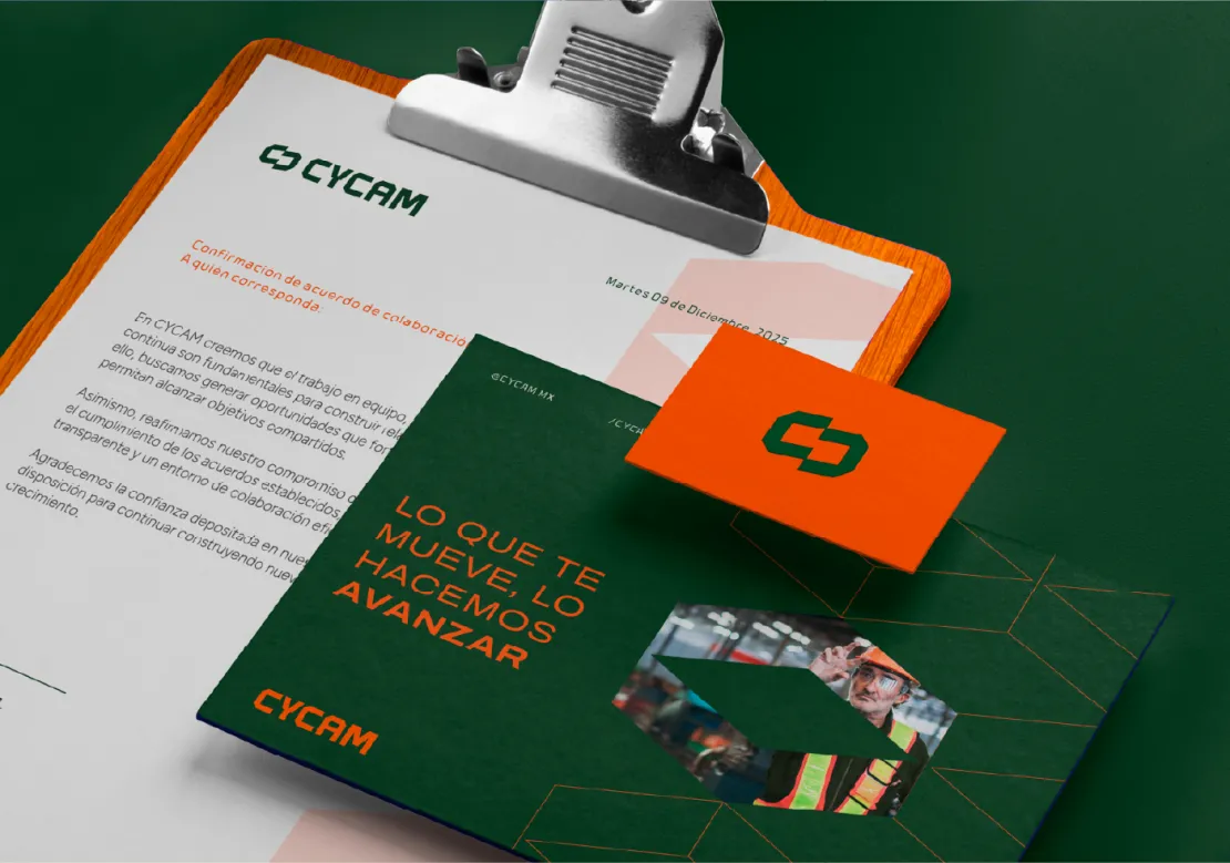
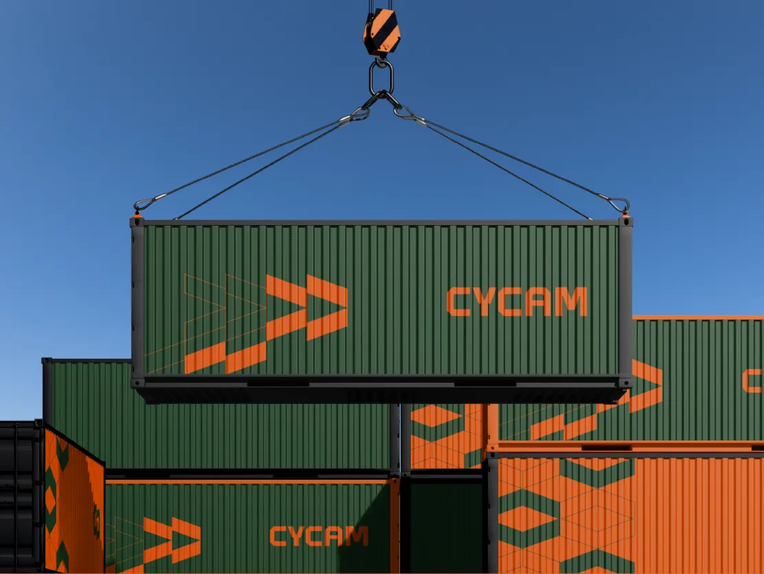
For the logo, we drew inspiration from the shapes of the cargo boxes and truck bodies the company manufactures. We designed bold lettering with straight lines and precise cuts, accompanied by a symbol formed by two facing “C” shapes that evoke both the links of a chain and the structure of a cargo box. This represents connection and CYCAM's role within the transportation process.
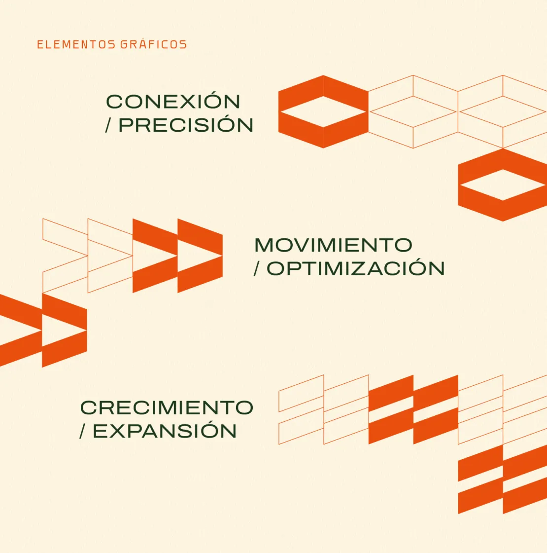
This same idea extends throughout the visual identity, where geometric shapes represent three essential aspects of CYCAM: connection and precision, through enclosed forms that symbolize the relationship between people and processes; movement and optimization, through shapes that move in the same direction, reflecting routes and transportation; and growth and expansion, through more robust structures that express the company's development, investment in machinery, and vision for the future.
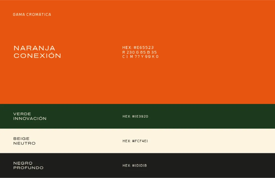
The green, orange, and beige color palette complements the design, creating a recognizable identity that combines its industrial expertise with a more approachable and contemporary personality.
The result is a refreshed visual identity that better represents what CYCAM is today and what it aims to build in the future.
A brand that communicates trust and experience while recognizing the dedication of the people who have helped it grow since the beginning.
Because moving cargo is about much more than transporting it from one place to another. It's about helping other people's stories continue to go further.