Creative Director: Andrea Lomelí
Art Direction: Julio Anaya
Copywriting: Diana Soberanis
Graphic Designer: Susana Vivas
REYCAM is a Puebla-based company specializing in manufacturing and customizing trailers for the agricultural, livestock, industrial, and recreational sectors. It also offers replacement parts and materials for those looking to build or adapt their own equipment.
Its roots lie in a family legacy dedicated to transportation, quality, and the people whose work keeps rural life moving.
In the countryside, every journey has a purpose. Transporting crops, hauling livestock, or moving machinery is part of the daily effort of those who work to keep things moving forward.
REYCAM was founded to support that work with durable, safe, tailor-made solutions. However, it needed a visual identity that better communicated the quality of its products and its close relationship with the people who rely on them.
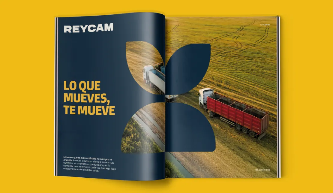
That led us to an idea that captures its essence: it is about more than moving trailers—it is about moving everything people build through their hard work.
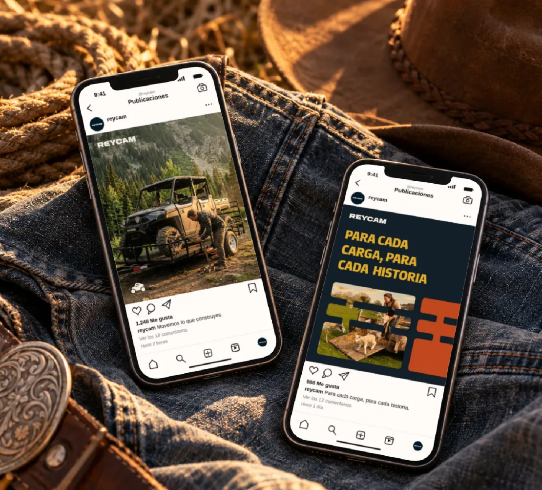
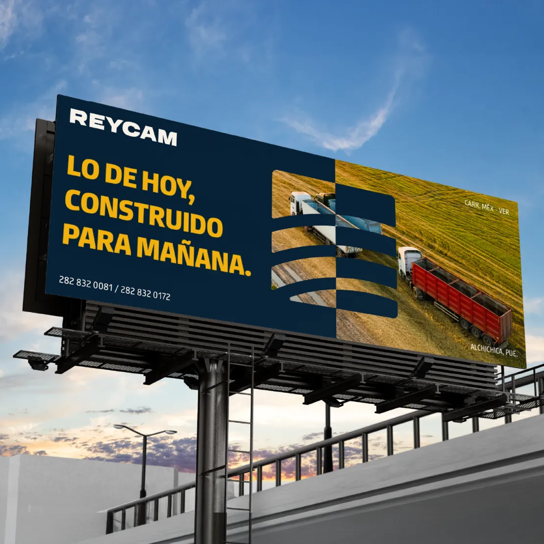
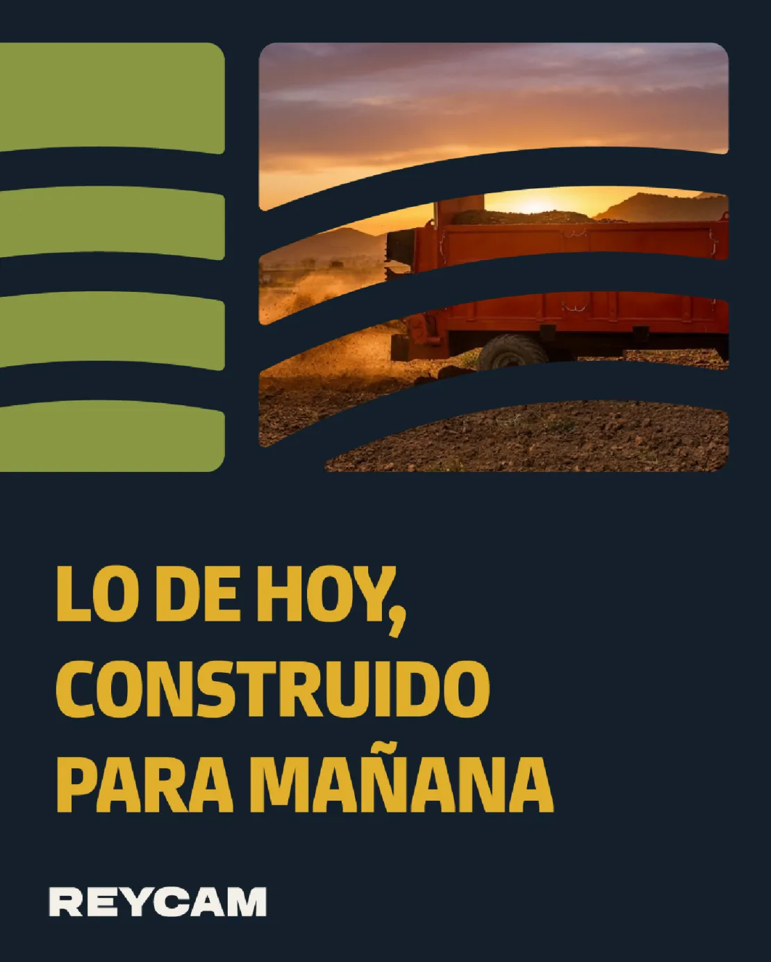
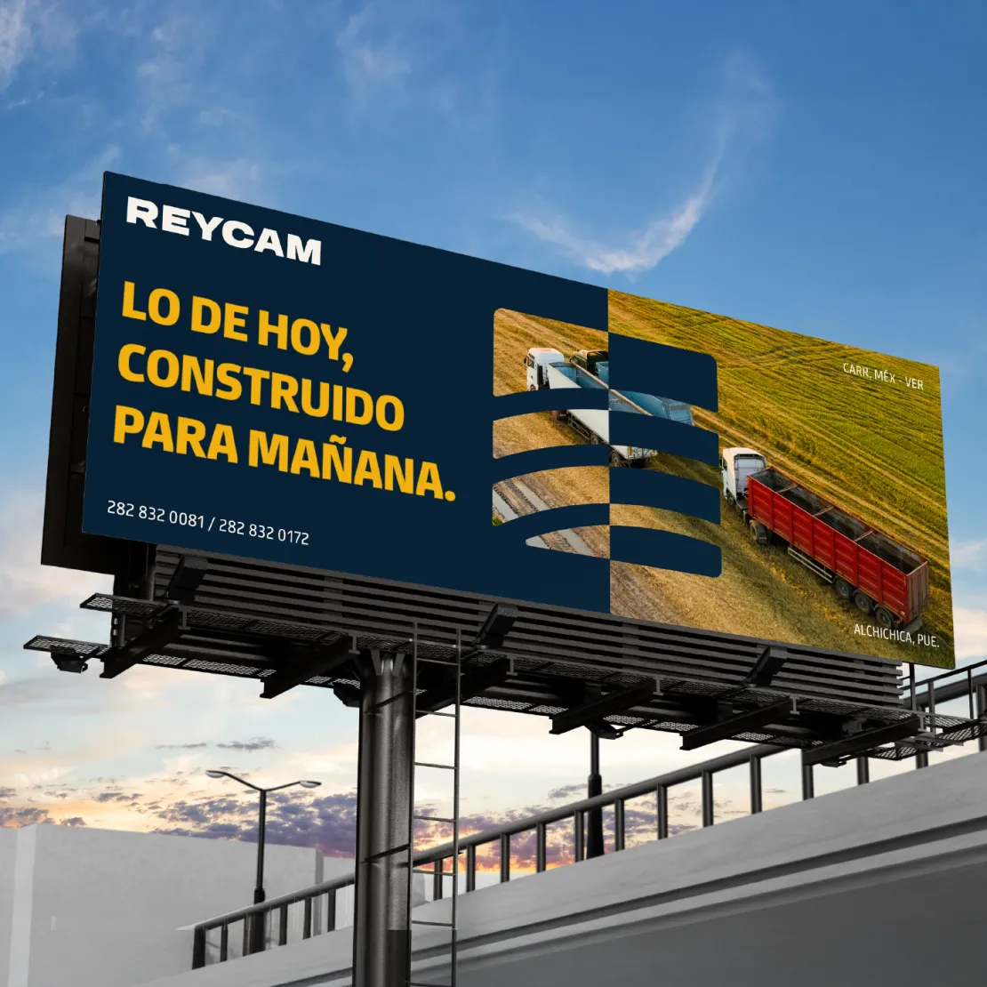
Under the concept “We move what you build,” we developed an identity that combines industrial strength with the approachability of people who understand the work firsthand.
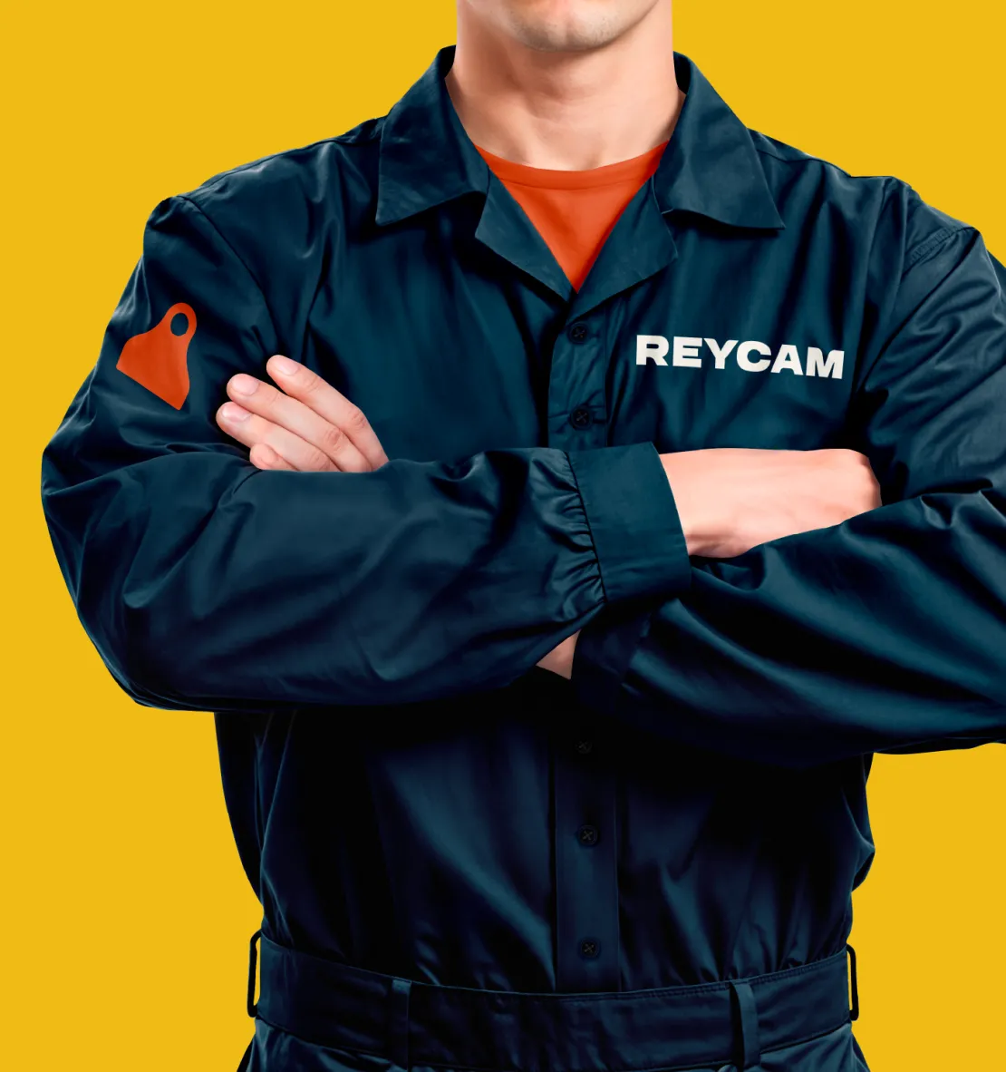
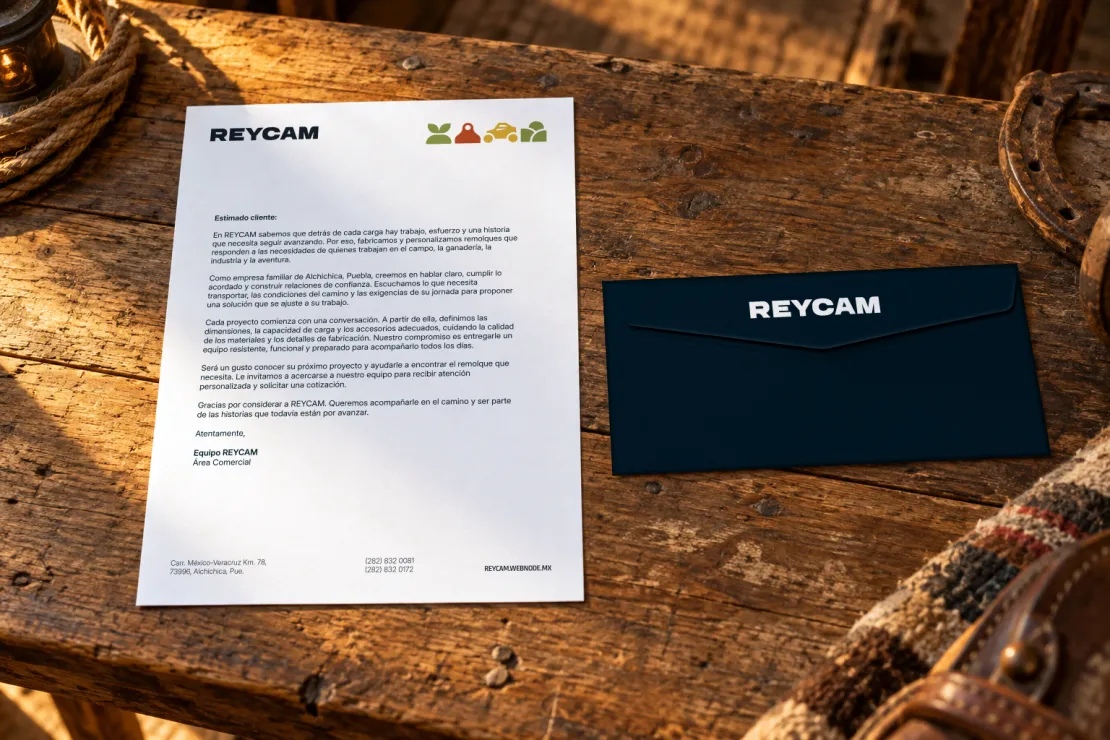
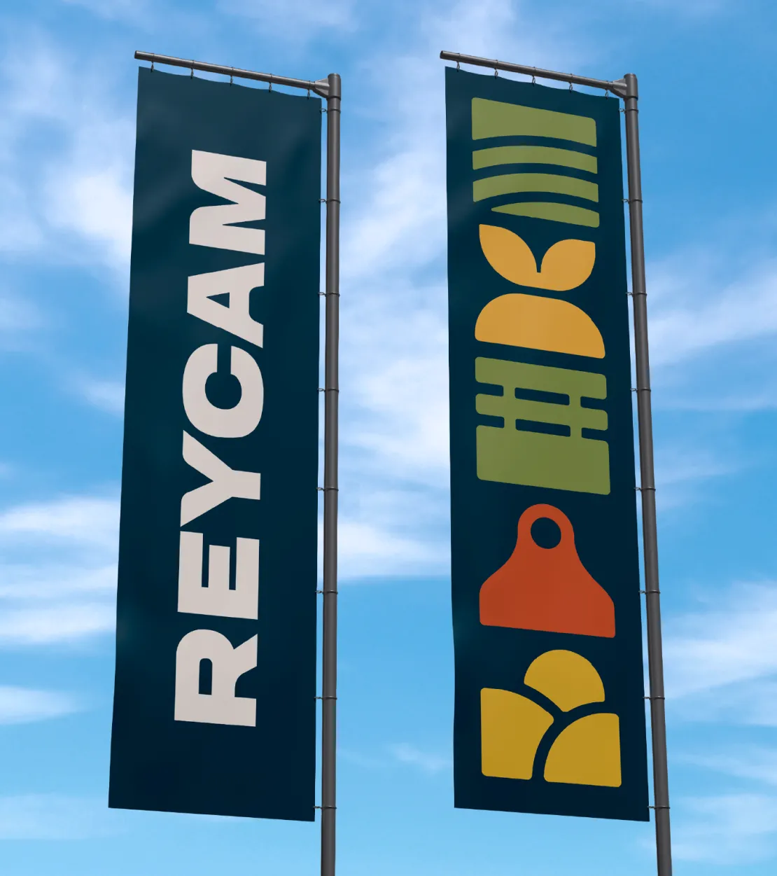
For the logo, we designed robust, timeless lettering with slightly rounded edges that soften its appearance and convey trust. We wanted the brand to reflect the durability and quality of its products while retaining the human, adaptable character that sets it apart.
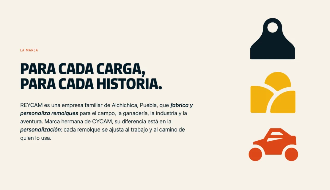
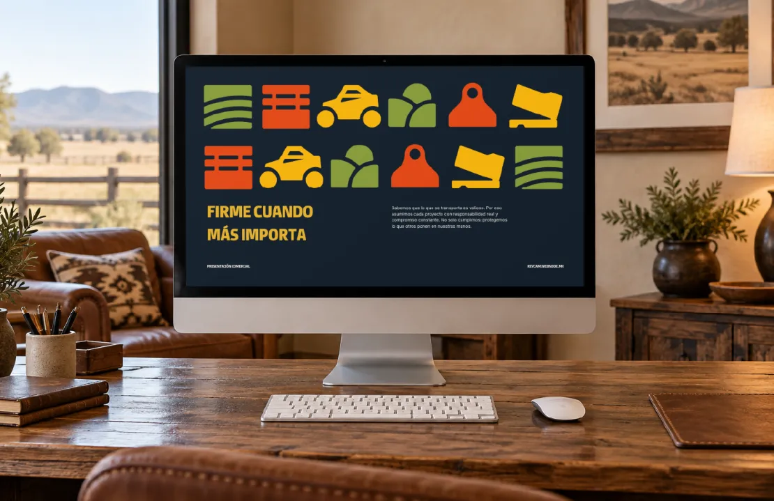
This same intention guided the graphic elements that accompany the identity. Inspired directly by the uses of its trailers, they represent animal transportation, agricultural activities, material handling, and recreational experiences. Each element helps tell the different stories of the people who are part of REYCAM.
The palette of dark blue, yellow, orange, green, and beige draws inspiration from rural landscapes and everyday life, creating a distinctive visual identity that feels strong and